UNICEF Italy
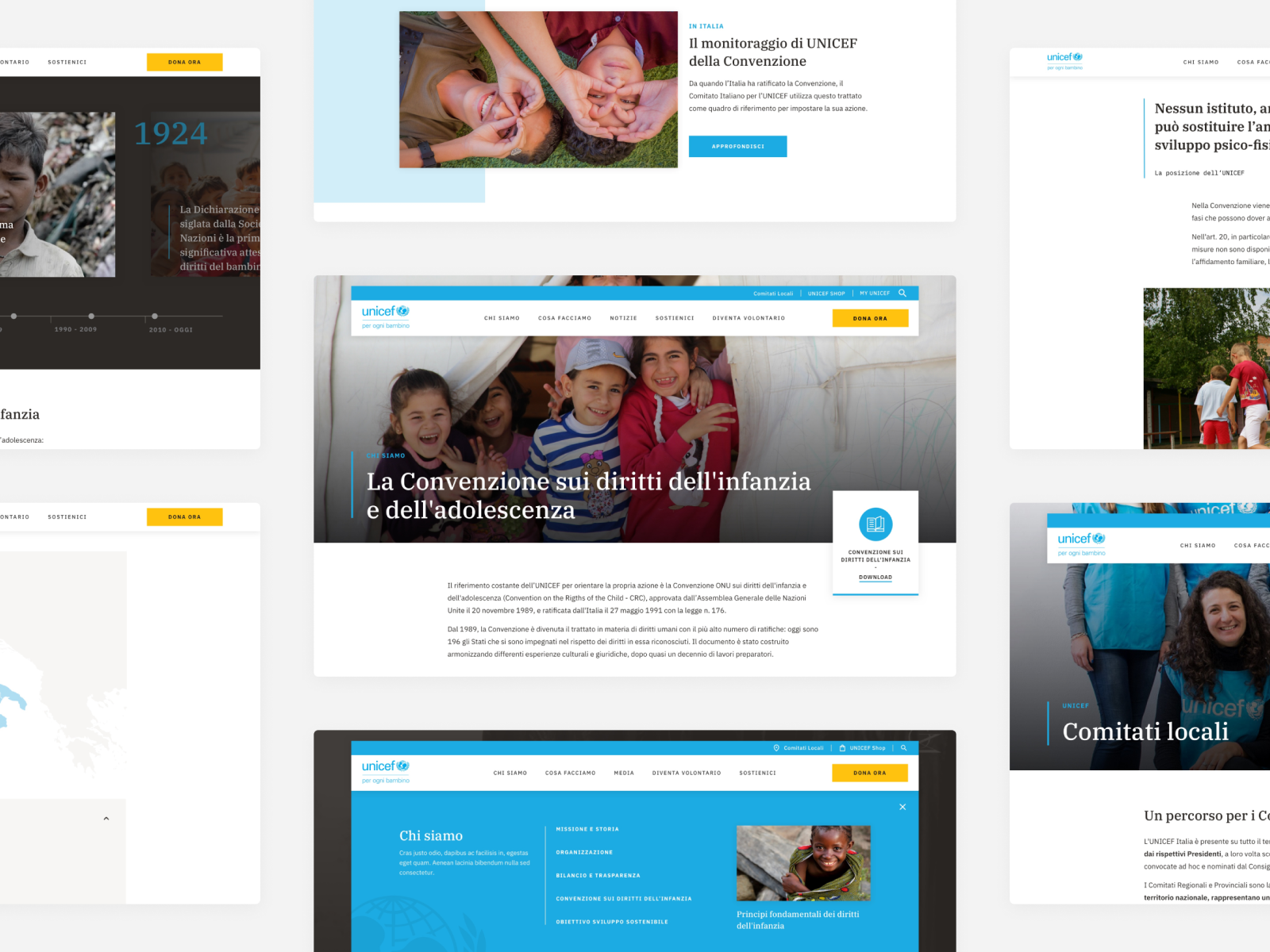
A new digital home for UNICEF
A new digital home for UNICEF
A new digital home for UNICEF
Project overview
UNICEF works in over 190 countries to save children's lives and to defend their rights, from early childhood through adolescence.
More than 1 million people each year visit the UNICEF Italy website to discover information, find updates and take action. The challenge was "how might we redesign the user experience of UNICEF Italy and make the content more accessible and engaging?"
We analyzed the old website and after mapping the contents (almost 10,000 pages between articles, press releases, projects, emergencies and campaigns) we realized that the examined content did not follow a clear information architecture, and many important contents were not easily reachable for users. We talked with different UNICEF teams to understand their needs and pains and we organized guerrilla inteview with donors, press office and journalist to understand how and why they use the website and which type of content they much read and appreciate.
After looking for best practices and trends from the market to build a design vision, we experimented an interview approach that quickly identified the needs and expectations for the different audiences. Then, we started several intensive ideation and co-design sessions with the internal stakeholder to develop a strongly relationship between the new website and the content needs.
So we started with the creation of the new information architecture were employees from each UNICEF areas were involved. Then we shared with them the main interaction and visual concept of the website and the components system proposed. After that we started with the detail design phase, working side by side with UNICEF team, we scaled the concept in a design system. During the development we helped UNICEF to scale all the content in the right way with the adoption of the new CMS.
—
Designed at Avanade with:
Danilo Rolle, Creative Director
Francesca Maio, Visual Designer
Angelo Oldani, UX Designer
Martina Ondei, UX Designer
Year:
2020
Design principles
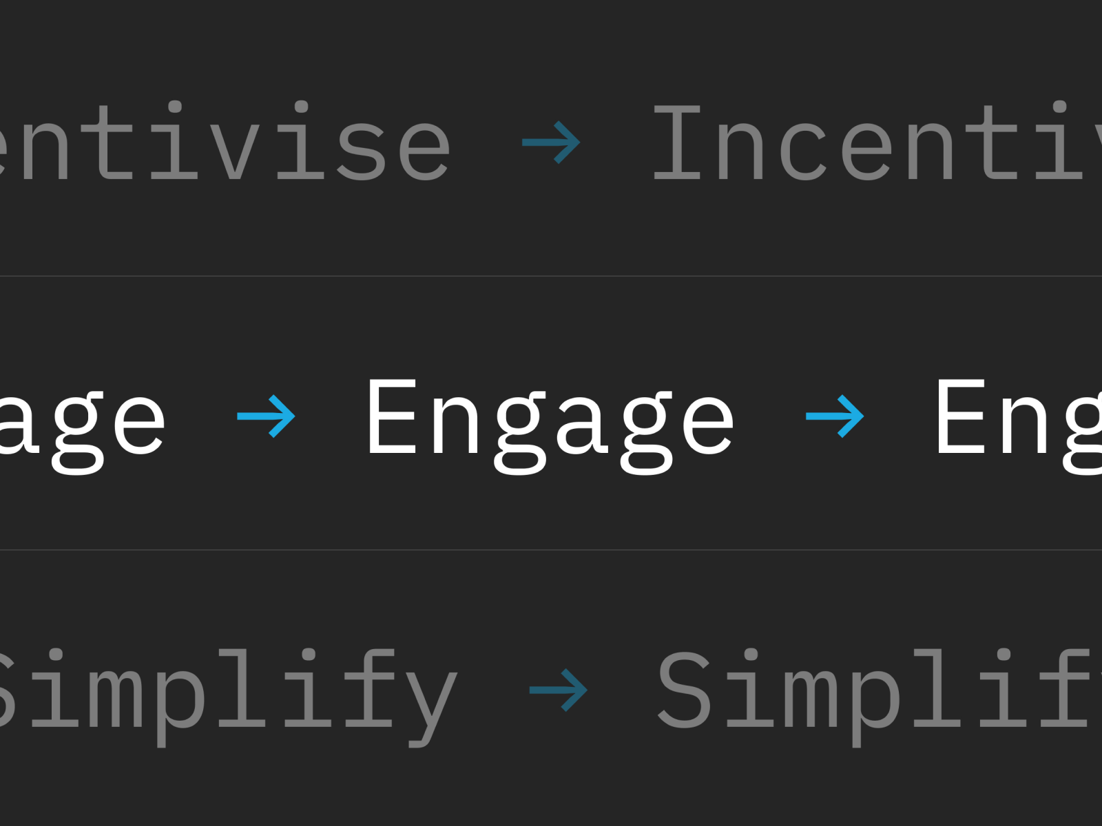
Based on our research results we defined the design principles to keep us on track during all the phases of the project.
Incentivise: encourage users to get into stories and contents
Engage: create an emotional relationship with the users
Simplify: design with a modular approach and reusable components
A circular experience
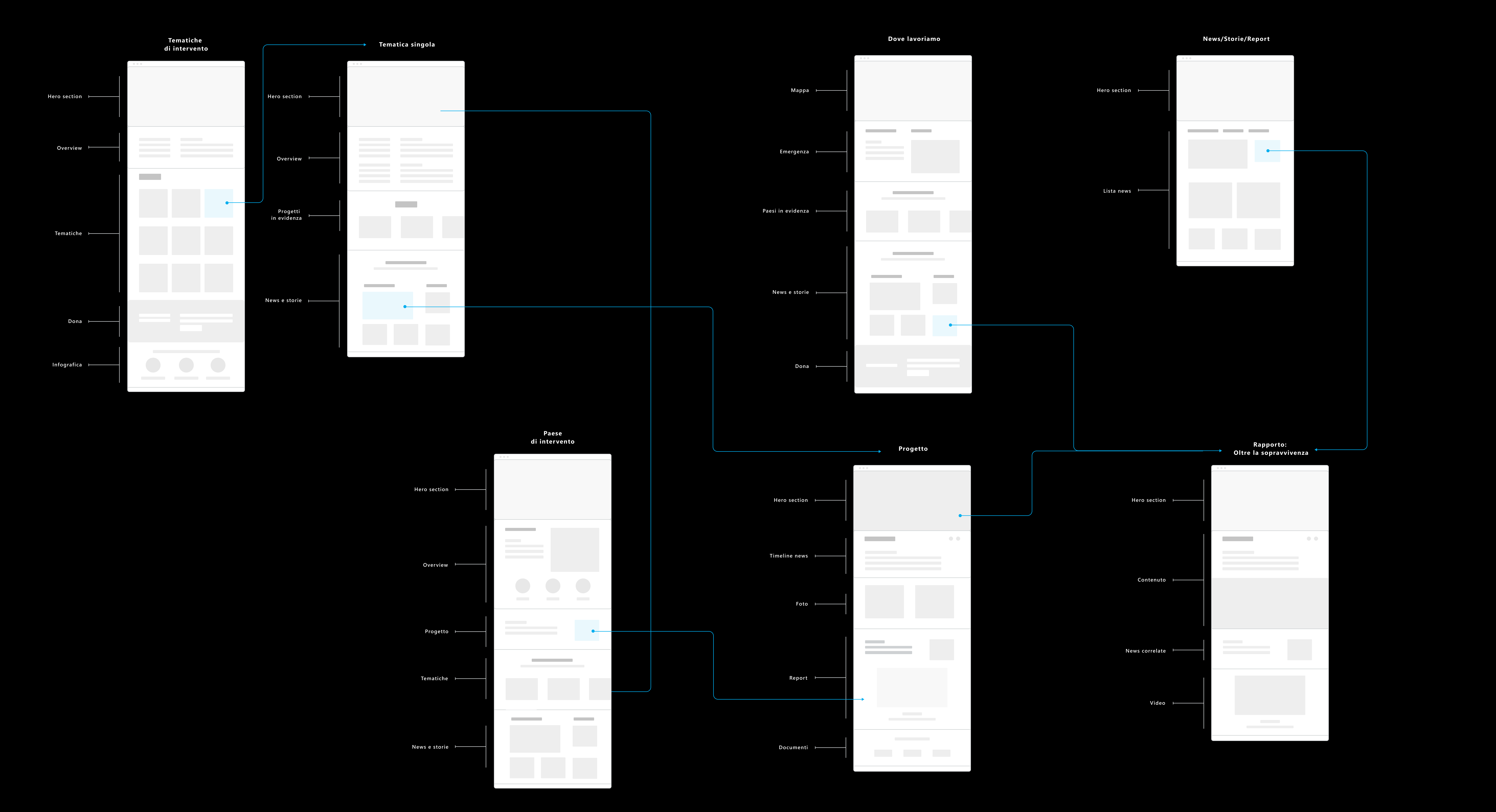
At the base of our concept there is the idea of connecting contents between pages, users will have the opportunity to deepen each issue by discovering suggested and related contents.
At the base of our concept is the idea of connecting contents starting from each page, users will have the opportunity to discover related content and deepen each issue
At the base of our concept is the idea of connecting contents starting from each page, users will have the opportunity to discover related content and deepen each issue
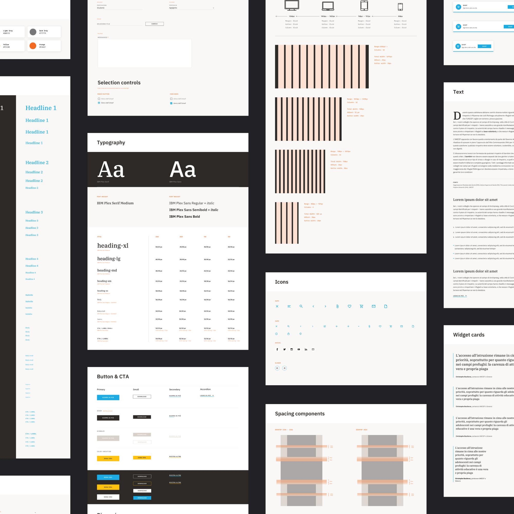
Design system and FE
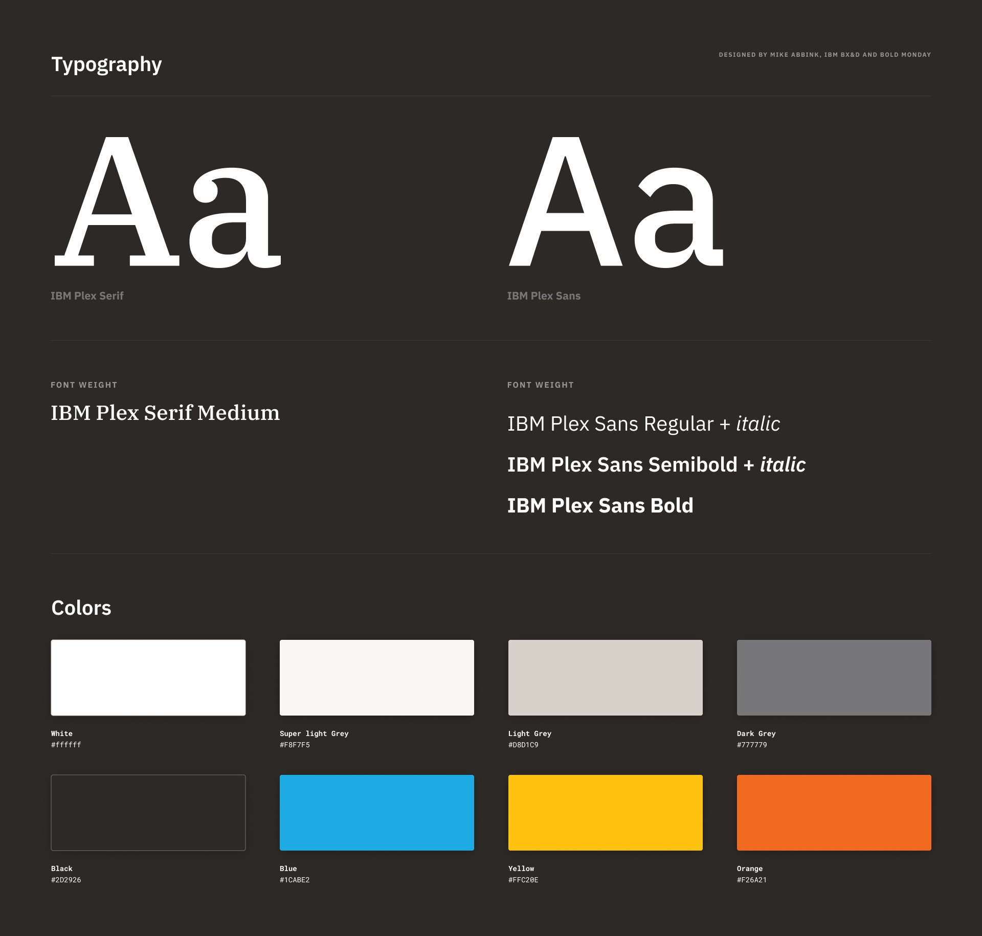
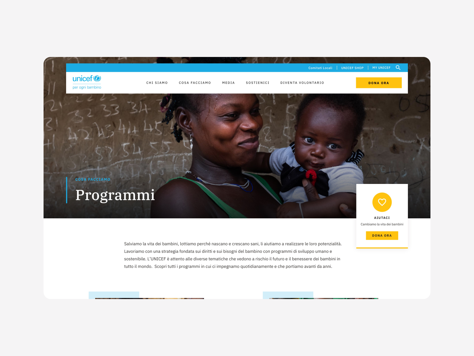
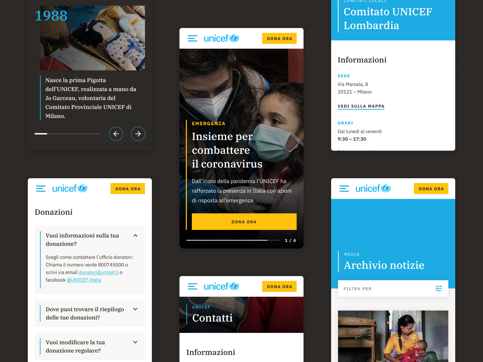
To ensure a fast and efficient development of the solution, our development team was involved in the project from the very beginning, bringing a technology perspective and promptly suggesting technical solutions. We created a design system in Storybook that helped us test all the coomponents before integrating them in the CMS.
